Last week I decided to update the design on this (rarely updated) blog for a few reasons:
- Changing the design is fun, and often easier than actually writing.
- I wanted a mobile-friendly, single column layout. I read a lot on mobile/tablet and a lot of sites/blogs format poorly.
- In the last couple years I've come to really like photos shown as large as possible regardless of medium. I think so many photo sites get this wrong. Recently Bijan Sabet's photos have been particularly inspiring to make this switch (as well as wanting to buy a Leica M240).
</ol>
To do that I overhauled my Jekyll-on-S3 blog (via this method) to remove an old blueprint grid system and replace it with a customized version of "Up", a Bootstrap-based Jekyll theme. Overall it was 90% of what I wanted (clean, minimalist single column) although getting it just to my liking took some overriding of their built-in styles.
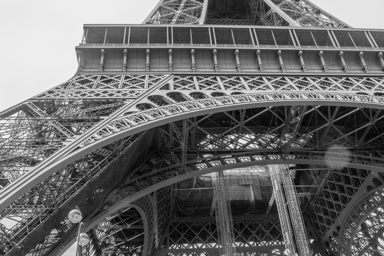
Specifically changed to a fluid layout with a max-width, and some padding on mobile/tablet (hat tip to Jonathan). I'm trusting the browser to scale the images (
max-width: 100%ala this) which seems to work well in relevant browsers. I took the above photo on a trip to Paris earlier this summer, and think it is much more interesting large. Then tested and tweaked it all using responsiView to make sure it looked good on different resolutions. Hopefully all of this will get me to actually finish more half-written drafts...